We are launching a new visual identity

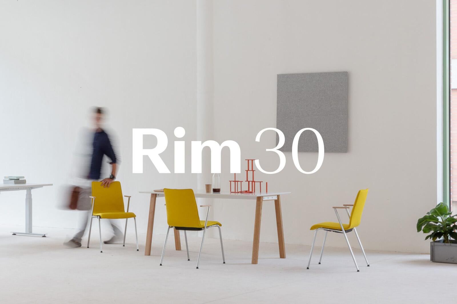
This year we are celebrating our 30th anniversary and among other things we have come up with a new logo and associated visual style.
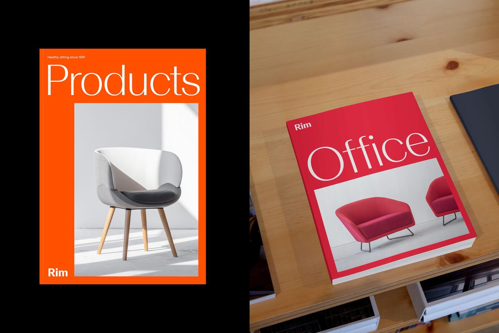
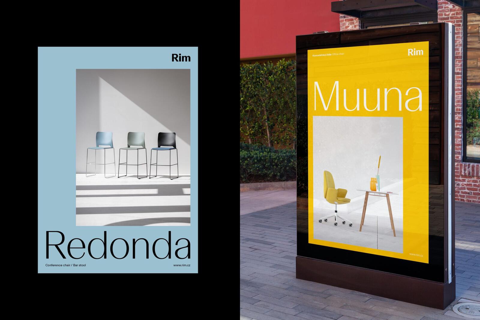
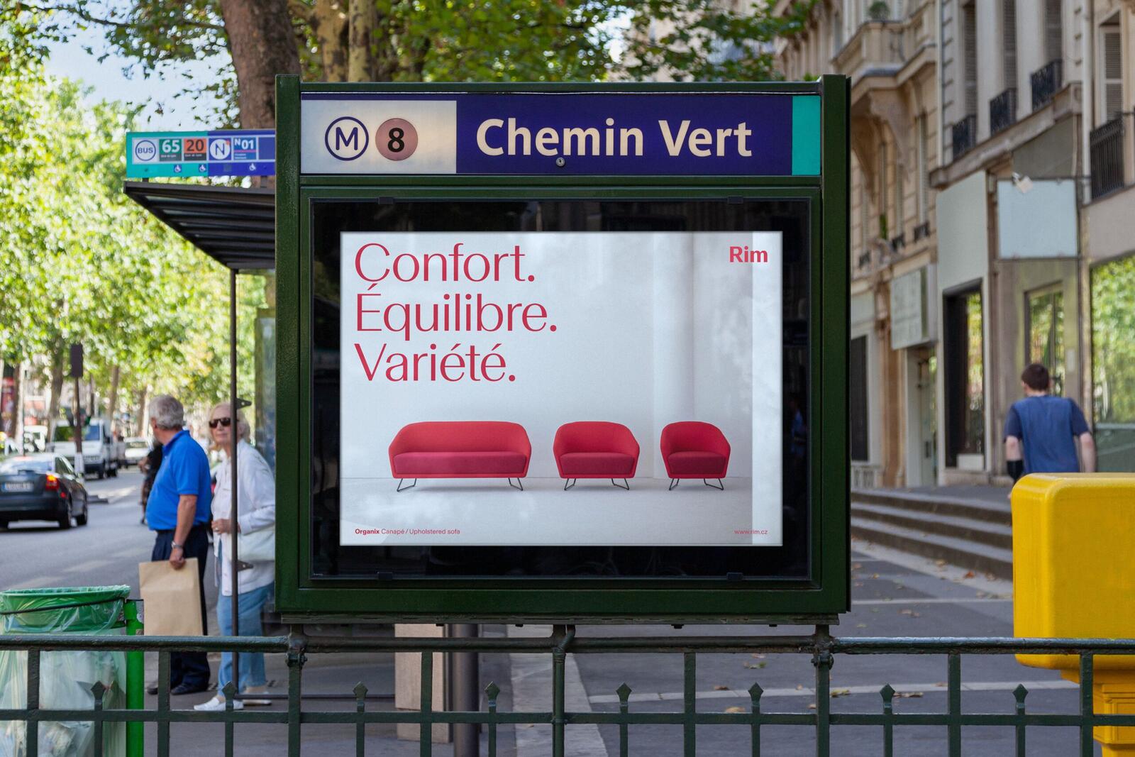
The new identity is based on the definition of our brand. It reflects current trends, the quality of our products, as well as our personal and friendly approach. The goal of this new brand identity is to strengthen communication with our business partners and at the same time focus on new, selected target groups of architects and designers.
Rather than a radical change, we chose evolution and focused on the development and shift of our current communication. We are building on the visual changes that began last year.
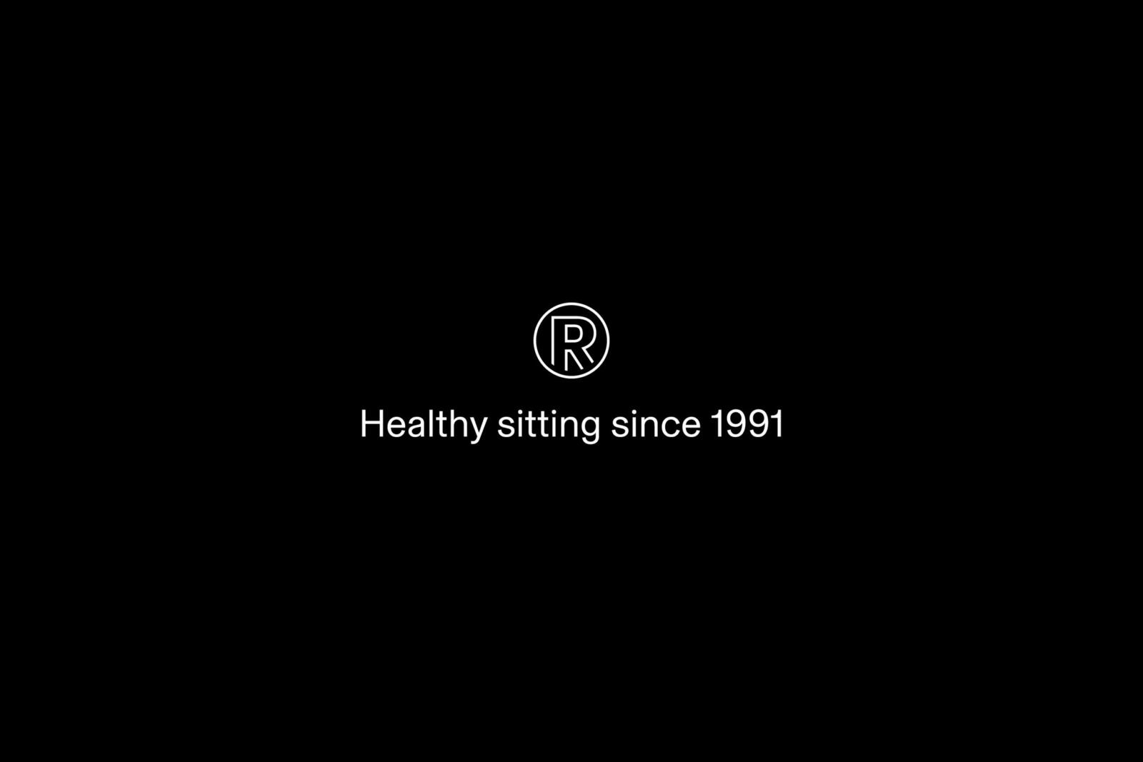
The core of our visual identity is a simple typographic mark, retaining the existing logic of letters with a capital initial letter R. The following circular monogram serves as an additional symbol. The main effort was that the whole identity, with its colour, directly follows the company’s products and creates a living environment.
We are gradually incorporating the logo into new printed materials along with online communications, and by the end of the year it should appear in most places, including showrooms and the products themselves.
The creators of the new visual identity are Marek Nedelka and Filip Dědic – a design team whose intention is to transfer valuable ideas into visual language.
